The Apprentice episode 1 logos - our thoughts
20th January 2022
posted 20th January 2022
The Apprentice is back and we are loving it so far. Creating a brand quickly is a challenge - we create logos daily for a diverse range of customers. Having a great logo for your brand can make a significant difference to your business. After watching the first couple of episodes, it got us thinking: what would we have done in a short time frame?
In this blog post, we’ll look at the logos from The Apprentice Series 16, episode 1 and give what we think are the pros and cons of each design. Finally, we’ll design our own take on what we would do in a brief time frame.
The Task:
The challenge in episode 1 was to create a marketing campaign for a cruise line. The candidates were given the freedom to choose their target market. They then needed to create a logo design and a social media advert for the cruise.
Logo 1 - Seaquility:
The boys team chose to target the over 55s, with the idea of a health and wellbeing getaway on a cruise. They came up with the name of ‘Seaquility’, combining the words sea and tranquillity.
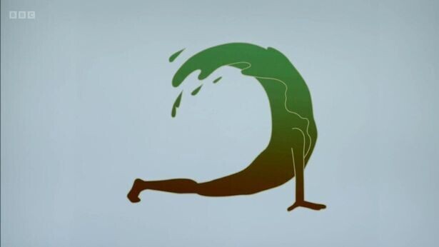
Image sourced from Independent: https://www.independent.co.uk/arts-entertainment/tv/news/the-apprentice-logo-episode-1-b1988547.html
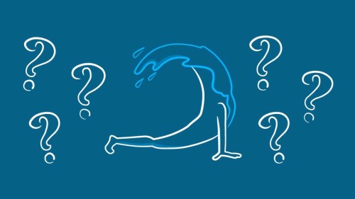
For the logo design, the logo icon is a person in a yoga pose with a wave coming out from their shoulders. The yoga pose represents the tranquillity aspect of the cruise. The wave represents the location of at sea. There was no text element in the logo.
It is hard to find pros for this logo design. The icon idea is there. If they had more time, this could have been improved upon. The logo itself isn’t finished, so it’s not really a logo. The cons outweigh the pros, these are as follows:
Text – There is no text on this logo – this is a biggie! Text is so important when it comes to logo design. A logo has little meaning unless there is text to anchor it. Text gives icons context and helps the viewer understand what they are seeing. Image and colour then evoke the feelings associated with the brand.
Colour – Colour is particularly important when it comes to design. Our brains associate colours with moods and feelings. In this logo they use green and brown. They mention that this is because it’s associated with nature and trees. For a cruise, this is the wrong colour scheme. It makes you think of the forest and not the open ocean. When you think of cruises you think of blue, white and yellow/gold. Blues would represent the sea and sky. White would represent the ship. The yellow/gold would represent the sun and the sand of the beaches. Having the wrong colour scheme throws the mood of the logo.
Icon – The icon idea is there, but it’s poorly executed. Having the wave coming from the shoulders doesn’t sit right and doesn’t show the concept idea at its best. The logo needed more definition of the person. As they often referred to it in the episode, it does look like a banana. With the colour scheme, a rotten banana.
When Lord Sugar first saw the logo, he said: “The last time I seen something like that, I called out Dyno-rod” - So with that in mind, can the Webfactory designers polish this turd?
Webfactory’s take on Seaquility:
For our quick take on the Seaquility logo from the brief. The company name is clear in a serif font. Colour scheme is a mixture of blues and white. The icon is a fluid line outline or a person doing yoga. We’ve also added a tagline to help anchor the meaning of the brand.
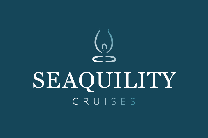
For this logo we used a Serif font. Serif fonts are fonts that have small lines at the ends of the letters. Using a serif font gives connotations of comfort, high end, and class. The colours of the logo are two shades of blue. The light blue is associated with the sea and sky, relating to tranquillity and the ocean. The darker blue gives a sense of luxury and class. The icon is a person doing a yoga pose made of fluid lines. This gives the sense of water and tranquillity. The logo gives the sense of a luxury, relaxing and calming cruise.
Logo 2 - Bouji Cruises:
The girls' team chose to target women aged 25 to 45, with the idea of a luxury girls' trip away. They came up with the name of ‘Bouji Cruises’. Bouji or Boujee, is a slang term used to mean luxury or upper class. The name was quite a controversial choice, as few people knew the definition of Bouji.
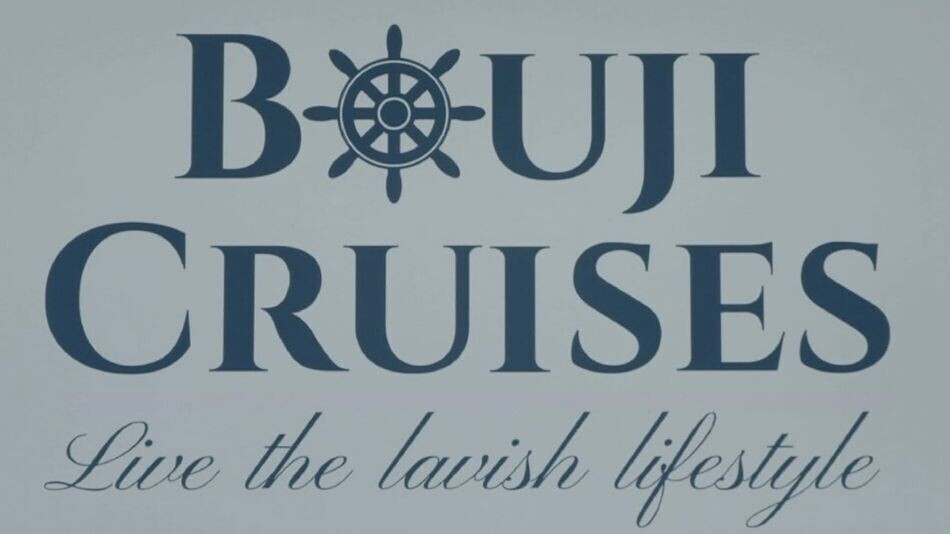
Image source from Mailplus: https://www.mailplus.co.uk/edition/tv/142310/apprentice-2022-bouji-or-boujie-meaning
For the logo design, they chose a subtle serif font. Pairing it with a script font for the tagline. The icon is within the design itself.
This logo does look more professional than the other team’s logo, as all the elements are there. For what they are trying to sell and the target audience, it misses the mark. The logo itself looks corporate instead of luxury. It would be more suited to a restaurant or black tie event, rather than a fancy girls’ weekend. There are a few cons to the design. These are as follows:
Text – The font chosen misses the mark a little. Serif fonts give connotations of luxury when used correctly. In this instance the font could easily be mistaken for a sans serif font. It’s also quite thick in places which makes it lose its elegance. For the tagline, the font chosen is hard to read. As Bouji is a unique name and not commonly understood, having the tagline clear helps give this meaning.
Colour – The colour scheme on this logo is better than Seaquility’s. The blue does give connotations of the sea. However, it doesn’t give you a luxury girls trip feel. It seems more suited to a general cruise.
Icon – The icon of the wheel looks out of place. It doesn’t fit in with the business concept or the style of the font. The type of wheel shown gives connotations of a pirate ship or sailing boat, not a luxury cruise.
Webfactory’s take on Bouji Cruises’:
For our quick take on the Bouji Cruises logo from the brief. The company name is clear in a serif font. Colour scheme is a mixture of black, pink/rose gold and white. Icon is a wave, outlining the word Bouji. Tagline is below the logo.
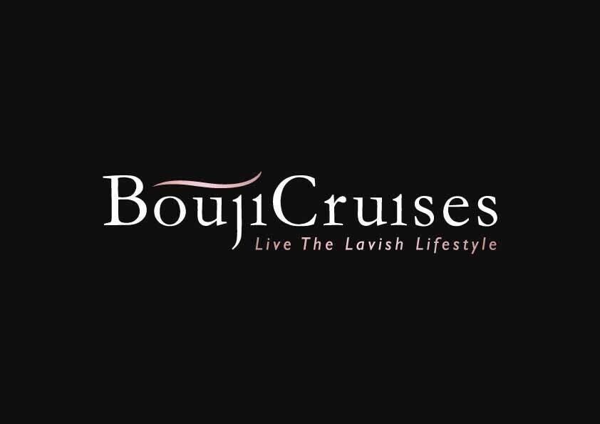
Using the serif font gives connotations of luxury and high end. This helps convey the ‘Bouji’ aspect of the brand. The black and pink colour scheme suits the target market. Black is associated with being sophisticated and classy. The pink/rose gold is associated with femininity and playfulness. The icon represents the waves of the sea, giving a nautical feel to the logo. The logo gives the sense of a classy, luxury and feminine cruise.
To learn more about logo design and how to create the perfect logo for your business, check out our article here.