The Apprentice episode 10 designs - our thoughts
24th March 2022
posted 24th March 2022
We’ve enjoyed series 16 of The Apprentice and the final is tonight! We know that creating a brand quickly is a challenge and having a great logo for your brand can make a significant difference to your business. We create logos daily for a diverse range of customers. After watching episode 10 of The Apprentice it got us thinking, what would we have done in a short time frame?
In this blog post, we’ll look at the packaging designs from The Apprentice Series 16, episode 10. We will look at the pros and cons of each design. Finally, we’ll design our own take on what we would do in a brief time frame.
The Task:
The challenge in episode 10 was all about baby food. Each team had to design and create a baby food product and pitch the ideas to prospective buyers. Whichever team made the most sales would win – simple. However, this time around there were no winners!
Team 1 – First Time Foodies
Team 1, came up with the idea of First Time Foodies. The concept of First Time Foodies was to create untypical baby food flavours, such as Asian cuisine. As one of the team was pescatarian, which means they only eat vegetables and fish, they chose a fish curry. The flavour they chose to run with was salmon and spinach curry.
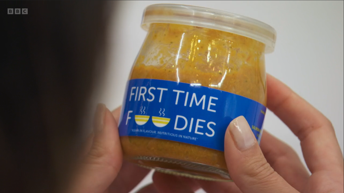
Image: First Time Foodies design.
For the packaging of their product, the team chose a simple sans-serif font for the logo and label text. Sans serif fonts are made of clean lines with no serifs (the little lines at the end). For the colour scheme, the team chose a background colour of primary blue, accompanied by accents of yellow and white. The main and only graphics featured in the design are two small bowls, replacing the ‘O’s in Foodies. The product has a small tagline featured on the font saying ‘Asian in Flavour, Nutritious in Nature’. The team didn’t feature the flavour on the front of the product.
Text – Replacing the ‘O’s in Foodies has caused a big issue with the way you read the name. Described as ‘the elephant in the room’ in the episode, the text appears to read ‘First Time F* Dies’. This was a big and costly error. No one would want to buy a product for a child associated with death. The connotations of the word would be completely off-putting.
The use of a sans-serif font on the front gives a mix of messages. Sans serif fonts give connotations of simplicity and friendliness, which is great for a children’s product. However, sans serif fonts can be seen as clinical. Without being paired with another font style to help with its meaning, the design becomes too plain and boring. It gives off connotations of seriousness, rather than fun or experimentation with food. The icons incorporated into the design do not add any playfulness to the design. They are quite rigid in appearance and small.
There is no flavour label on the product itself. Flavours should be clearly shown on the front label to avoid confusion. It’s not clear what the product flavour is.
Colour – For the colour scheme they have chosen a primary blue and yellow. The team seemed to pluck the colour blue out of thin air. The colour isn’t associated with the flavour of the product itself. However, the use of primary colours is good as it’s basic colour theory. Primary colours are associated with child development and learning. However, in this context, it doesn’t make much sense. The colour pairing could have been used better. There isn’t enough contrast/playfulness between the colours used within its layout. Without contrast, the design isn’t very eye-catching for children.
Graphic – The graphic elements of the design are minimal. There isn’t much going on in the packaging other than within the logo. Children’s products tend to be fun and loud in design; this is the opposite. They could have been more playful with the graphics and had fun with the design. They tried to add some playfulness to the bowls within the text. However, the positioning of the bowls was poor and made the text look like a censored swear word. The bowl design was basic and ridged in appearance. They chose bowls to represent Asian cuisine, but they didn’t give those connotations.
Overall the design is too formal and lacks visual design. With children’s products, you want to create a bit of excitement, this doesn’t do that. They did try to add some fun but it wasn’t enough and back-fired.
Webfactory’s take on First Time Foodies:
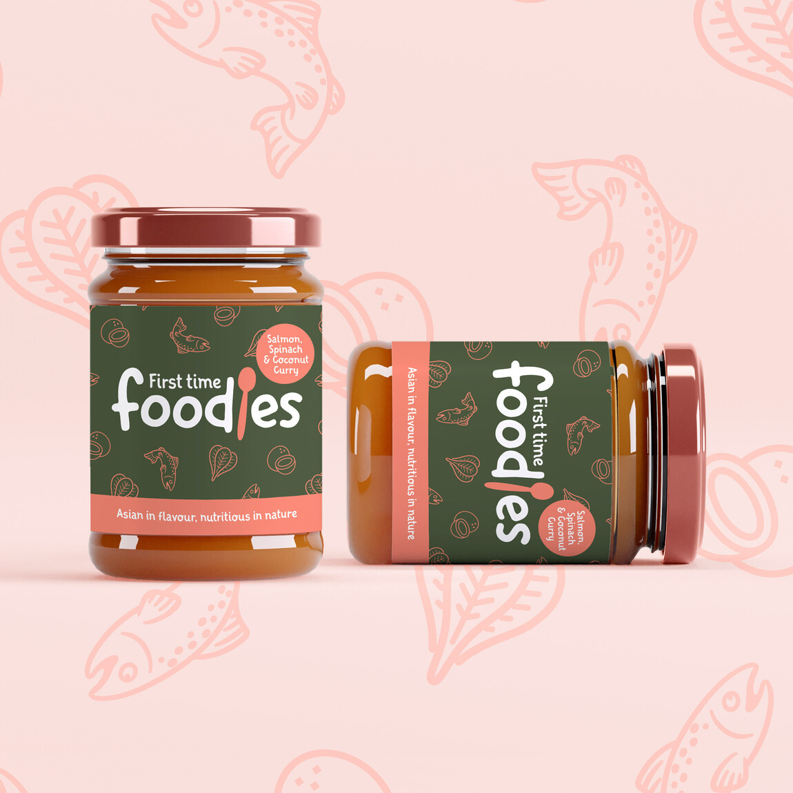
Image: Webfactory’s take on First Time Foodies design.
For our quick take on First Time Foodies we’ve gone for a louder and brighter design. The product name is clear in the centre, in a handwritten/child-like font. The colour scheme is spinach green and salmon pink. The brand name has a baby spoon incorporated into the design. The flavour is clearly labelled.
The handwritten font adds a bit of childish playfulness to the design. The font type gives connotations of youthfulness, indicating the product is for children. The colour scheme of spinach green and salmon pink represents the flavours of the product. Together they create high contrast, which is eye-catching to the consumer. The use of colour can be adapted to other product flavours. The flavour of the product is clearly labelled and easy to spot, accompanied by colour indicators.
The background pattern adds a bit of fun to the design. The pattern icons represent the ingredients of salmon, spinach and coconut. This could easily be adapted to other flavours in the range to showcase flavours.
Team 2 – Little Taste Adventure
Team 2 came up with the idea of Little Taste Adventure. Little Taste Adventure is a vegetarian baby food of tastes around the World. The flavour they went with was a vegetarian Moroccan medley.
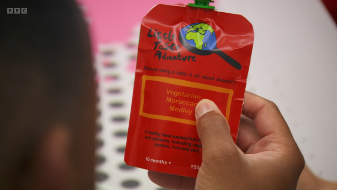
Image: Little Taste Adventure design.
For the packaging logo, the team chose a decorative hand-drawn font. For the rest of the packaging, a simple sans serif font. Primary red, combined with orange, black and white was selected for the colour scheme. The main graphic of the design shows a frying pan/magnifying glass with the world inside. The tagline reads ‘because being a baby is all about discovery’. The product flavour is featured boldly on the front.
Text – For the text, they have used a combination of handwritten and sans-serif fonts. Using the two font types helps the design appear more playful. The hand-drawn font does add some playfulness to the design, giving connotations of youth. The team used a serif font for the remainder of the package. They didn’t get the font balance right. The use of sans serif overpowers the use of the hand-drawn font, leaving the design looking a little plain and serious.
Colour – The overall colour scheme is quite dark and gloomy. You would expect something vibrant and playful for a children’s product. This makes the text in general hard to read. It would also make it difficult for the consumer to read the product at a glance on a shelf. The red does give a nod to the Moroccan flag, however, this may not be common knowledge. The tone is harsh in appearance with the black font. As mentioned above, it makes the text difficult to read. The combination of orange and red does give a sandy feel to the design, which does make you think of Morocco.
Graphic – The main graphic is a bit hard to make out and is confusing. The icon is a frying pan/magnifying glass with the world in it. The world icon does represent the exploration part of the product, which is great. However, the use of the frying pan/magnifying glass is where the message gets lost. The design creates mixed messages for the consumer. The use of the frying pan can carry negative connotations in this context. Frying pans are associated with unhealthy fried food, which you wouldn’t want to feed your child. This would put off the consumer.
The design is basic and dark in appearance. Much like the first design, you would want to create a bit of excitement with children’s products. The overall tone and lack of contrast makes the product unappealing to the eye and hard to read.
Webfactory’s take on Little Taste Adventure
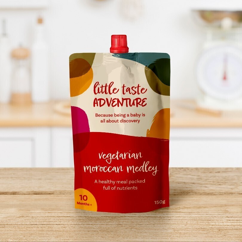
Image: Webfactory’s take on the Little Taste Adventure design.
For our quick take on the Little Taste Adventure, we’ve gone for a more visual design. The product name is clear in the centre, in a handwritten font. We’ve chosen Moroccan feel colours for the designs of reds, oranges and greens. The flavour is clearly labelled.
For the design of the packaging, we wanted a more fun feel. The handwritten fonts adds a bit of childish playfulness to the design. As the product is all about adventure and discovery, we wanted to create a bit more contrast between the elements on the packaging, creating a more playful feel. The shapes look like blobs of paint or different purees, which adds connotations of discovery and experimentation. Discovering new feels and textures with their hands in sensory play.
The colours of the packaging are more varied and have a Moroccan feel to them. The colour palette signifies the different flavours, with the bottom half of the packaging providing a large colour block. The colour block helps show the flavours boldly on the shelf. This can also be applied across the range and be adapted to other flavours.