The Apprentice final - our thoughts
22nd April 2022

posted 22nd April 2022
We’ve enjoyed series 16 of The Apprentice and redesigning the series logos! We know that creating a brand quickly is a challenge and having a great logo for your brand can make a significant difference to your business.
In this blog post, we are going to do a slightly different take on our usual format. Instead of recreating the logos, we’ll evaluate the designs created in the series final and show you what Harpreet’s new brand looks like now! We will then do our own quick take on Pyjamily.
The Task:
This series’ finalists were Harpreet Kaur and Kathryn Burn. As it was the final of The Apprentice, they turned their business investment proposals into reality, then pitched them to Lord Sugar and his business pals.
Harpreet Kaur – Oh So Yum!
Harpreet is in the business of baked sweet treats. Creating yummy bakes that will keep you ordering time and time again, with the unique selling point (USP) to deliver to your doorstep nationwide! During the brainstorm session, Harpreet and her supporting team came up with the name ‘Oh So Yum!’. The idea was to create a name that sounds like something you would say when eating one of her delicious creations. With the name decided, it was time to create the brand logo. The image below shows the logo created for Oh So Yum!.
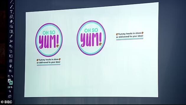
Image: Oh So Yum! logo from The Apprentice finals
For the logo design, Harpreet wanted something that would work great for social media. Round logos are perfect for social media profile images, as well as stickers for her products.
Text – For the text of the logo, she chose a combination of sans serif and handwritten fonts. This works really well for the design. The sans serif font gives positive meaning to the design. Sans serif fonts give connotations of being clean, progressive and trendy, signifying that the business is modern and innovative with its products and has good kitchen hygiene. Being a business that handles food, this is great. The use of the handwritten font signifies creativity, suggesting playfulness with favours and products. The contrast between the fonts is fun in appearance and adds a bit of playfulness to the logo. The overall text design is well-balanced, simple and effective.
The tagline design looks like a bit of an afterthought. It feels a bit disconnected from the body of the logo. The style isn’t in line with the name.
Colour – Colours chosen for the logo are vibrant and playful. The magenta pink and vivid blue create high contrast. This makes the design stand out. The pink gives connotations of sweetness and playfulness, which in context works great for a bakery. The blue gives connotations of reliability and trust. Signifying that you can rely on Oh So Yum! for a quality product and reliable delivery.
Graphic elements – The graphic elements of the logo are the weakest area of the design. The two-tone circle works well. It’s bold, contains the content and would work great for social media and stickers. However, the design of the cookie icons doesn’t match the design well. The style looks like an emoji icon, throwing off the two-tone style. It also gives the impression that the business just makes and sells cookies – which is not the case. They could have used crumbs instead, something more vague but associated with a bakery.
Oh So Yum! Rebrand
In our usual format, this is the point where we re-design the logos from the episode. However, since winning the series, Oh So Yum! has had a rebrand and we love it! The design is fun and inviting.
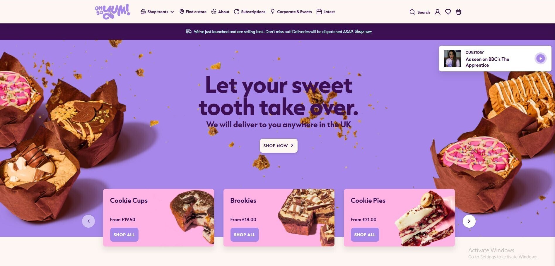
Image: Oh So Yum! rebrand by MWB Agency.
For the rebrand, Harpreet has gone for a vibrant and bold design. The logo itself is a decorative font with a playful twist. The use of the decorative bubble-gum style font gives connotations of sweetness and cheekiness. This is great to be associated with a bakery, as it signifies that ordering from Oh So Yum! is a cheeky sweet treat you can’t help but love.
The icon of the design is a tongue sticking out of the Y. This gives connotations of fun and playfulness. Combined with the tagline of ‘Let your sweet tooth take over’, signifies that once you’ve tried one of their treats, you won’t have self-control, your sweet tooth will takeover.
For the colour scheme of the branding, Harpreet has opted for sweet pop colours. This helps add to the vibrancy of the branding. Combined with the white background this creates high contrast which is eye-catching. Pink gives many positive connotations. The colour pink is associated with love and emotion, evoking feelings of love for the products and brand. The lilac colour gives connotations of luxury, mystery and creativity. This signifies that Oh So Yum! creates premium baked goods with a creative twist.
Overall the new branding is great! Well balanced and bright, evoking all the right emotions.
Kathryn Burn – Pyjamily
Kathryn’s business specialises in matching Pyjama’s, creating on trend designs for all the family. With the USP of being able to match Pyjamas with your pets! During the brain storm session with her support team, they quickly came up with the name Pyjamily. Combining the words pyjama and family. Once decided, it time to design the brand logo. The image below shows the logo created for Pyjamily.
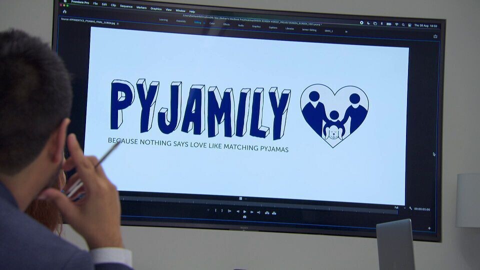
Image: Pyjamily logo from The Apprentice finals
For the design, Kathryn wanted to create something trendy - appealing to all ages and genders.
Text – For the text of the logo she chose a decorative font paired with a sans serif font for the tagline. Although the decorative font choice isn’t giving off the trendy vibes intended, it works well. The style gives connotations of friendliness and comfort, which is great for pyjamas. The illustrative style of the font helps signify creativity and handmade designs. However, it could possibly be seen as a little youthful.
The tagline is in a sans-serif font. Giving connotations of being contemporary and reliable, which is great to be associated with. However, the font size is too small to make any obvious emotional impact. The contrast between both fonts is too much and they don’t fit together well.
Colour – The blue colour chosen for the logo is a bit washed out. The tone doesn’t create high enough contrast against white. Blue gives connotations of trust, dependability, reliability and peace. Although the meaning is positive, it doesn’t create the impression wanted. The blue would be more suited to a tech or law firm. As mentioned in the consumer research section of the episode, it goes give the impression of being a charity shop for the reasons above.
Graphic elements – The graphic elements of the logo are the weakest area of the design. The graphic shows two adults, a child and a dog within a heart. The icons themselves are related to the brand. However, its composition doesn’t help clarify the brand. It doesn’t give the impression of a pyjama party, more like the two adults comforting their child who is holding a dead/sleeping pet. Combined with the colour, it does give the impression of a pet support charity rather than fancy pyjamas. The illustration style doesn’t match the font style. If the icon was a similar style to the font, it could have looked better.
Webfactory’s take on Pyjamily
For our quick take on Pyjamily, we’ve gone for a more vibrant design.
Image: Webfactory's redesign of Pyjamily
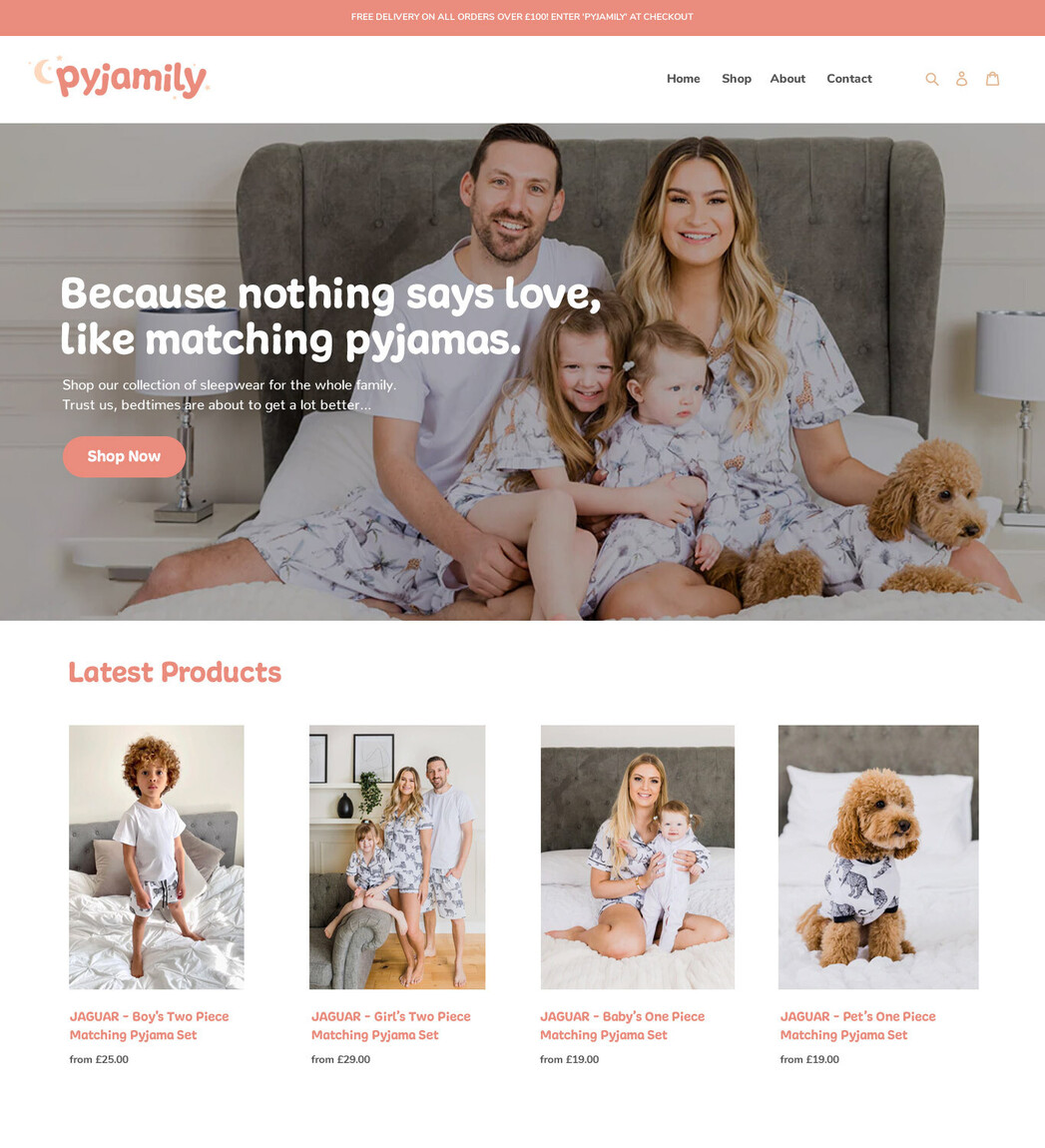
Image: Webfactory's redesign of Pyjamily website concept
The colour scheme is soft orange and peach. The orange gives connotations of warmth, happiness and friendliness – this is a great association for pyjamas made to match for families and friends. Peach gives youthful notes to the design, which is great as it’s aimed at all ages.
For the logo font, we’ve chosen a soft sans serif. The soft design gives connotations of plushness, comfort and softness. This signifies that the pyjamas are not only stylish but comfortable and relaxing to wear.
Icons are the moon and stars. Both symbols are both associated with the night. This gives connotations of sleep and relaxation.