The Apprentice logo challenge - s18 ep5
5th March 2024
posted 5th March 2024
We’ve been enjoying The Apprentice 2024 so far. We are 5 episodes in, and we’ve been treated to another branding task! So once again, we’ve challenged our design team to recreate the logos that the teams created.
In this blog, we'll look at the logos from The Apprentice Series 18, episode 5. We'll analyse both team’s logos, giving our opinion on their designs and choices. Then we’ll be taking on the challenge of redesigning their logos. We know that designing under pressure on a short time scale isn’t easy. So, we'll be creating them during a similar time frame.
The Task
This week’s challenge was all about Formula E. Formula E is an all-electric and environmentally friendly motorsport world championship. Both teams had to create and brand their own Formula E team. This included creating a brand identity and designing a car livery. They then hosted launch events to pitch to brands in the hope of securing sponsorship deals. The team that made the most profit from their sponsorships were the winners.
After a double sacking the previous week, the teams were shuffled about again to make things even.
Logo 1 – Team Nexus
In this week’s task, team Nexus decided to centre their design around the world’s oceans. Their project leader, Tre Lowe was the one who came up with the idea. He stated that; 'When people think of ecological damage, they tend to think of plastic pollution. It’s killing our marine life; it’s killing the seas’. Plastic pollution is a critical issue. However, it’s distinctly different from the emissions produced by combustion-engine vehicles. A more cohesive approach would have been to focus on the rising sea levels caused by global warming, as car emissions are a contributor to this. This would have aligned the concept with the promotion of Formula-E.
In the end, we think the logo the team designed deserved to be tied to a cinder block and thrown into the ocean to sleep with the fish. However, a design this bad would most certainly be classed as polluting the ocean!
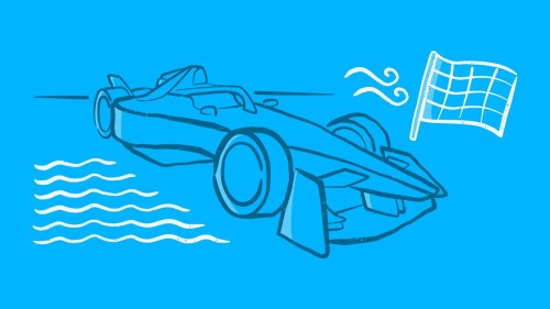
For the logo design, the team chose a decorative style sans serif font paired with a blue and grey colour scheme. For the icon, they had a racing car on a track surrounded by the sea.
Image: Team Nexus logo for ‘Sea the rebirth of speed’.
Image: Team Nexus car design.
Text: Focusing on the text, the team have opted to use a pun in the name - ‘Sea the Rebirth of Speed’. Although this is playful, in this instance the use of a pun was not the most appropriate choice. Formula-E is a very serious and elite sport that has a very professional image. The use of a pun in this instance may detract from this and undermine the team’s credibility within the sport.
The team has chosen a font composed of horizontal lines - a common choice in motorsport branding to convey a sense of speed and movement. While this font style can be effective, the team could have enhanced it with italics. This would have emphasised the notion of forward movement/speed within the design. On its own, the text works. However, when combined with the image it gives the overall look of an eight-bit video game - which doesn't give connotations of a prestigious Formula-E team.
Additionally, the horizontal lines of the font coincide with those of the waves, causing the text to blend in rather than stand out. This lack of distinction diminishes the impact of the logo, obscuring the team's identity within the overall design.
Colour: For the colour, the team chose blue and grey. Instead of using a deep shade of blue that would be representative of an ocean, the team used a very light shade of blue. The tone was more representative of the sky than the sea. This doesn’t match with the overall ethos of the brand.
The use of grey in the logo was a good choice as this is a colour that is associated with carbon fibre. Carbon fibre is a material synonymous with elite motorsport; however, there is very little of this in the final design.
Icon: For the icon, the team used several elements including a car, a road, a finishing line, and waves. The inclusion of so many elements means that the logo is incredibly busy and cluttered. The car in the design also looks like it’s driving through the sea, rather than on top of it. Alan Sugar remarked in the boardroom: ‘The sea’s parting, who’s driving the car, Moses?’.
The car the team have decided to use is also not representative of a Formula-E car. In fact, the car the team have used appears to have four exhaust pipes next to the number plate, which means it’s not even an electric vehicle - something that seemed to be overlooked in the episode.
Image: Close-up of car used in the logo.
In conclusion, the team's logo falls short of capturing the essence of a Formula-E brand. They've fallen into the trap of over-illustrating the company's activities within the logo. It looks more like an illustration than a logo design. A logo’s primary function is to serve as a recognisable identifier and evoke emotion. If you take, for instance, the Apple logo: the logo doesn't directly convey the company's products yet remains instantly recognisable. It evokes connotations of Isaac Newton's apple and discovering new technology. If they focused more on a distinctive mark, rather than attempting to describe it, the team could have achieved a more effective logo.
Webfactory’s take on Logo 1
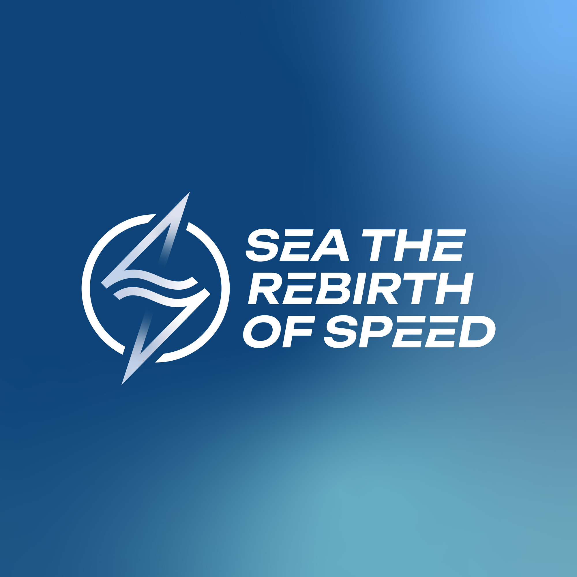
Image: Logo design
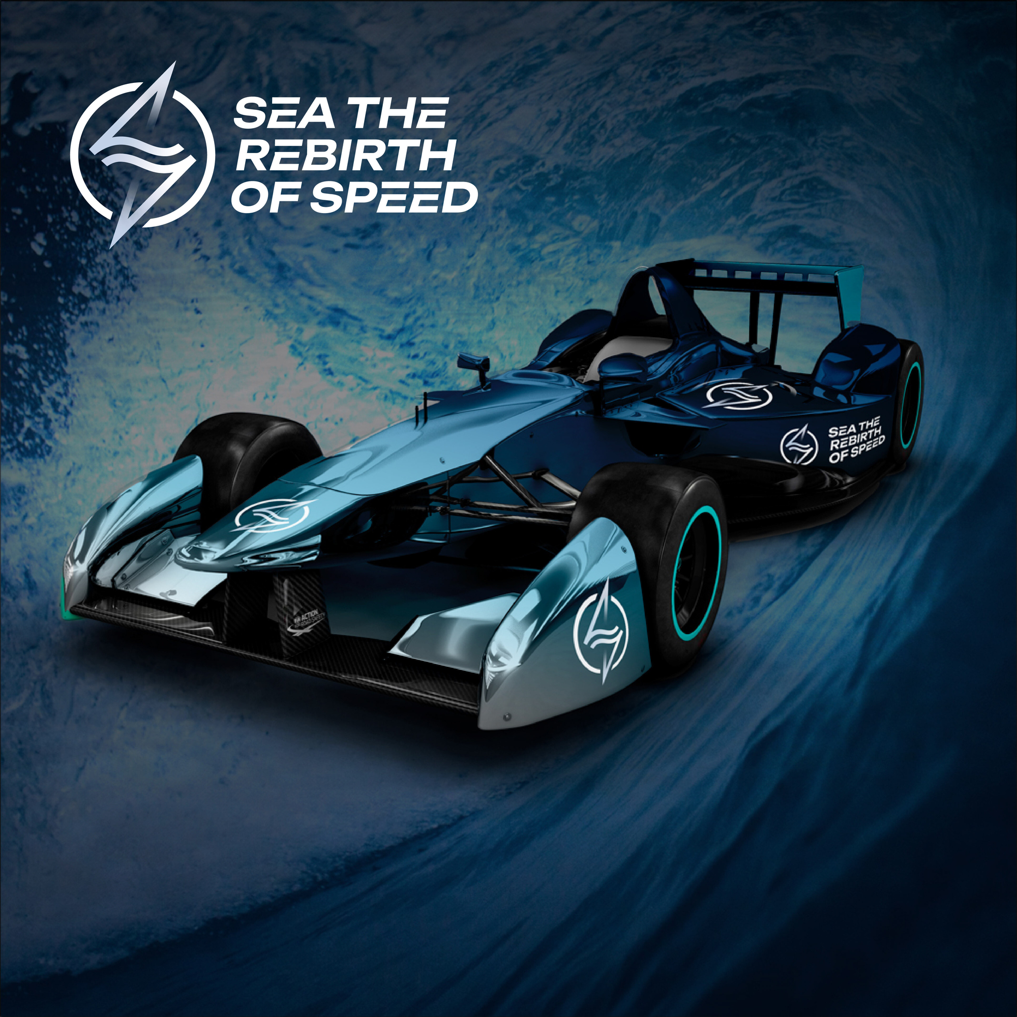
Image: Car livery
For Webfactory’s quick take on Team Nexus’s logo, the link between electric cars and their impact on the ocean was emphasised.
To emphasise the ocean theme of the brand, I have used a colour palette that uses a mixture of blues. This gives an underwater feel to the design and connotes the team’s ethos.
The icon is a badge-style emblem with an energy bolt with sea waves in the centre. The energy bolt gives connotations of the fully electric racing cars emphasising the power source behind the speed. A bolt can also be seen as high energy and fast giving a sense of speed to the logo. The waves in the centre show that the impact of the ocean is at the heart of the team making the ocean topic its main focal point. It also adds motion to the logo design.
The font used is a bold sans-serif font. Sans serif fonts are modern and clean in appearance giving connotations to the modern technologies used for eco-cars. The font is slightly italicised adding speed and movement to the design. The 'E' in the logo text has a standout design to emphasise the eco aspect of the vehicle.
Logo 2 – Team Supereem
Team Supereem based its brand ethos on Air focusing on air pollution and emissions. When discussing their direction, the team focused on the targets set to be net zero by 2050. Their brand was to home in on this. They also discuss focusing on the three E’s and emphasising the E part of Formula E.
When it came to creating the logo, the branding team veered off task. Instead of focusing on the air aspect of the design, they seemed to create a more earthy design giving mixed messaging. Like with the first logo, there was no real team name as such, just a slogan.
For the logo design, they chose a decorative style font for the slogan. They paired this with a colour combination of grass green and orange. The icon was a racing flag with a tyre surrounding an earth in the centre being blown by wind.
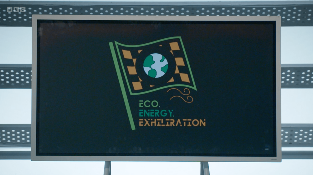
Image: Team Supereem logo for 'Eco, Energy and Exhilaration'.
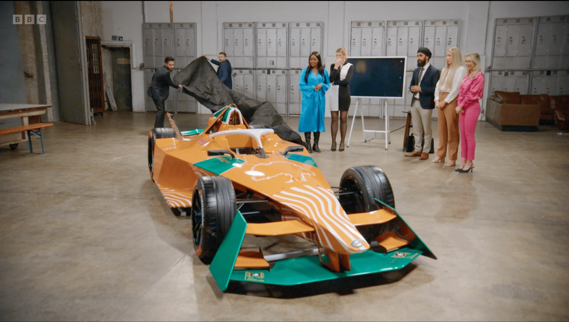
Image: Team Supereem car design.
Text – Focusing on the text, as mentioned above, they chose a decorative-style font. Decorative-style fonts are great for adding some style and expression. They can help portray personality with the connotations they can give. In this instance, the choice of font design doesn’t work with the message they're trying to portray. The font design gives connotations of industrial cargo. It has a stencil-like and fragmented appearance. It doesn’t give connotations of clean air which is what they're trying to portray. When you think of no pollution or emissions, something clean to represent clean air comes to mind. The fragments taken out of the words also make it a little tricky to read - something bolder would have been more suitable and easier to read from a distance.
Colour – For the colours, the team chose green and orange. When watching the episode, it didn’t seem like the team put much thought into picking the colour scheme. When designing they added the colours of the earth to the earth icon, which was predominantly green. They just decided that orange went with green and inserted this in the logo. The choice of green does give connotations of nature, health, and the environment. Orange gives connotations of energy, confidence, and warmth. Although both choices could be good for something associated with the environment, they don’t represent the team ethos of air pollution or racing. When you think of air, you think of blue or light white colours. The shades of the colours used have produced something that looks quite heavy and earthy which is the opposite of air. The colour scheme isn’t something that you wouldn’t want to be associated with speed.
The colours aren’t great; however, they are balanced which is good. The use of colour in separating each phrase gives each word a standalone impact which is a nice touch.
Icon – For the icon, the team chose a racing flag with a tyre surrounding an earth in the centre with wind below. The team seemed to pick symbols that represented all aspects of the environment. The use of the flag gives connotations of a checked flag which is representative of the sport. The use of the Earth gives connotations of the environment, plants, and dirt. The use of the tyre gives connotations of cars. However, it also gives connotations of burning rubber around a track. This is a negative link and isn't environmentally friendly. The use of the air/wind scribbles is the only symbol that represents wind/air, which is the team's ethos. However, where it is positioned, it looks like it’s blowing the flag rather than it’s the focus of the brand. It’s also drawn in a different style to the other illustrations. The other illustrations are vector-drawn graphics whereas the wind looks more hand-drawn/organic. Overall, none of the symbols or the way they are combined portray their message. It’s all just a bit too much.
The size of the icon compared to the text is very overpowering. It’s much larger than the text, which draws your eye to the earth. The position of the icon makes the logo top left heavy. This gives an unbalanced appearance like the logo could topple over any second.
In conclusion, like the first team, the logo doesn’t represent the brand ethos. They too have fallen into the trap of over-illustrating. This has resulted in confusing messaging. The logo is clunky, heavy, and cluttered. They also could have benefited from keeping it simple.
Webfactory’s take on Logo 2
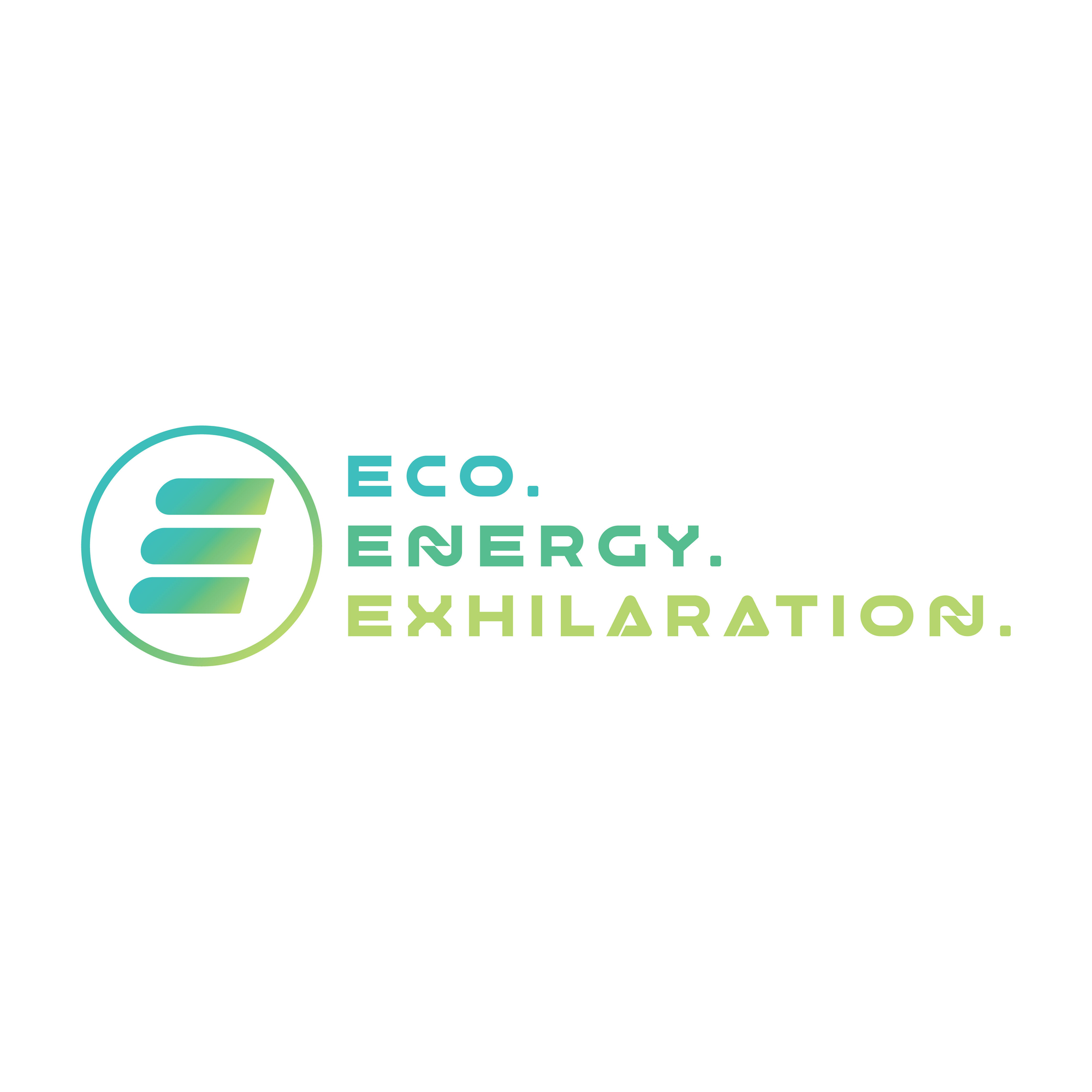
Image: Logo design
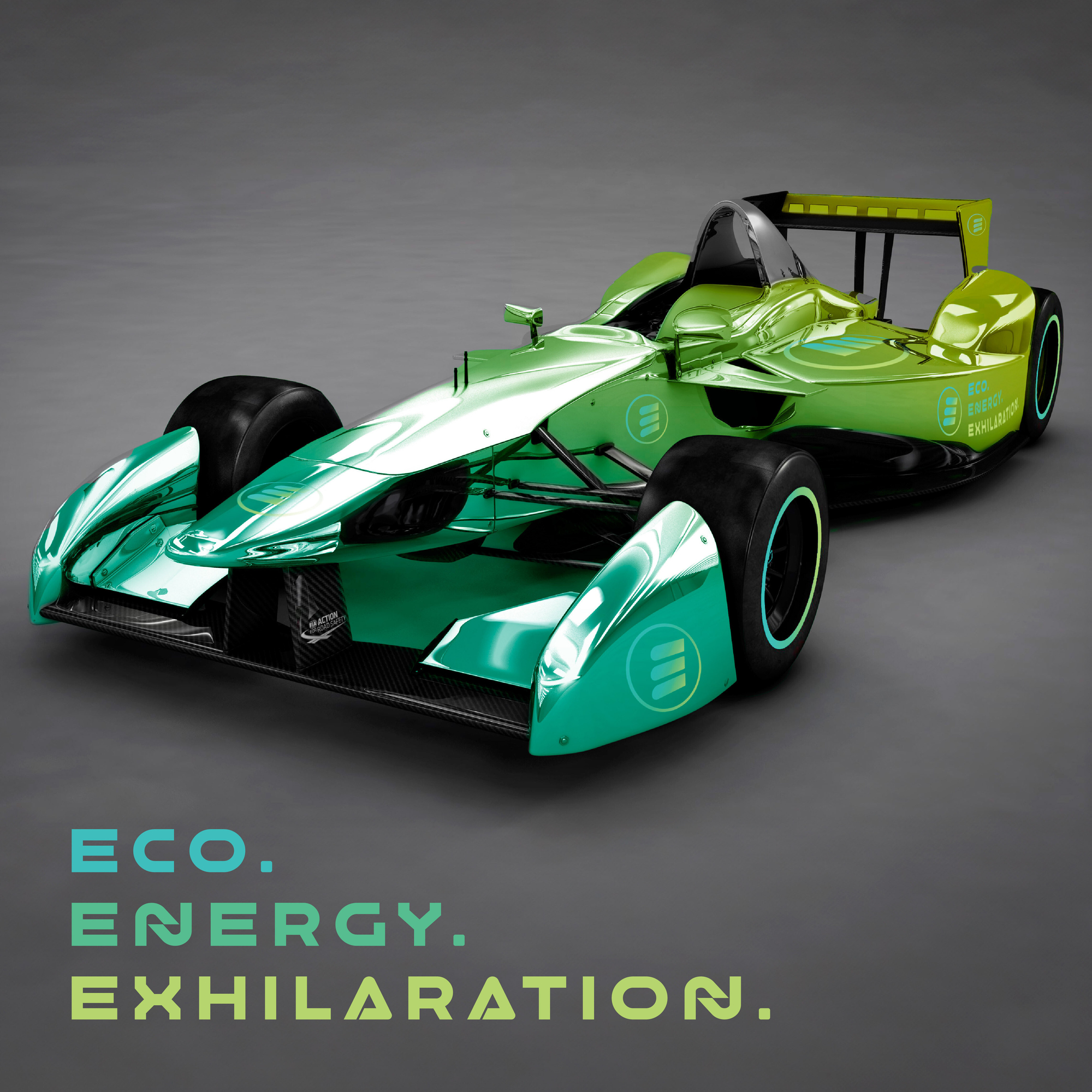
Image: Car livery
For Webfactory’s quick take on the Team Supereem’s logo, we focused on the clean energy aspect of the ethos.
The colour scheme is blue and green. The blue is representative of the air and cleanliness. The green is representative of the environment and green energy. This gives overall connotations of purity and cleanliness. Showcasing the brand ethos of clean air and no emissions. The colour gradient gives connotations of these two things blending seamlessly. With green energy comes pure air and eco-friendly sports. The colour pairing has a lot of energy, making it striking and memorable. It also gives connotations of a speedometer, adding acceleration to the logo.
The ‘E’ icon represents the 3 points of the name, Eco, Energy and Exhilaration. The design of the 'E' looks like a battery symbol. Representing clean electric energy. This paired with the colour, also shows the transition of electricity into sport. With eco being in blue then transitioning to zesty green for 'exhilaration'. This gives energy to the design and creates excitement for eco sport. The design of the 'E' is slanting forward, again helping to create a sense of speed and energy.
The font used for the design is a decorative sans serif font. Its style is futuristic and modern, representative of its technology.
Learn more
We designed our livery for our Webfactory cars. With the expert help of Poppin Graphics, we had our fully electric fleet wrapped to perfection! To learn more about our branded electric cars you can read our article here.
If you are interested in logo design, you can learn more about how to create the perfect logo for your business in our article here.