The Apprentice logo challenge - s18 ep10
5th April 2024

posted 5th April 2024
We tuned into The Apprentice episode 10 on Thursday night for the last branding task before the final. We’ve assembled our design team for a re-design challenge!
In this blog, we'll look at the logos from The Apprentice Series 18, episode 10. We'll analyse both the team’s logos from the episode, giving the pros and cons of each design. Our designers will then take on the challenge of redesigning them. We appreciate that designing in a short time scale isn’t easy - so, we’ve set ourselves a similar time frame.
The Task
This week’s task was all about vegan Cheese! Both teams had to create and brand a new vegan alternative to cheese before pitching it to industry experts. The team that gets the most orders wins.
Logo 1 – Team Nexus ‘Scrumptious Spreads’
In this week’s task, team Nexus wanted to create a luxury vegan cheese spread. For the flavours, they chose Truffle and crispy vegan bacon pieces.
For the logo, they wanted to create something simple, using a sans-serif font for the brand name. Next to the brand name they added a set of jars. For the colour scheme, they chose royal blue and white.
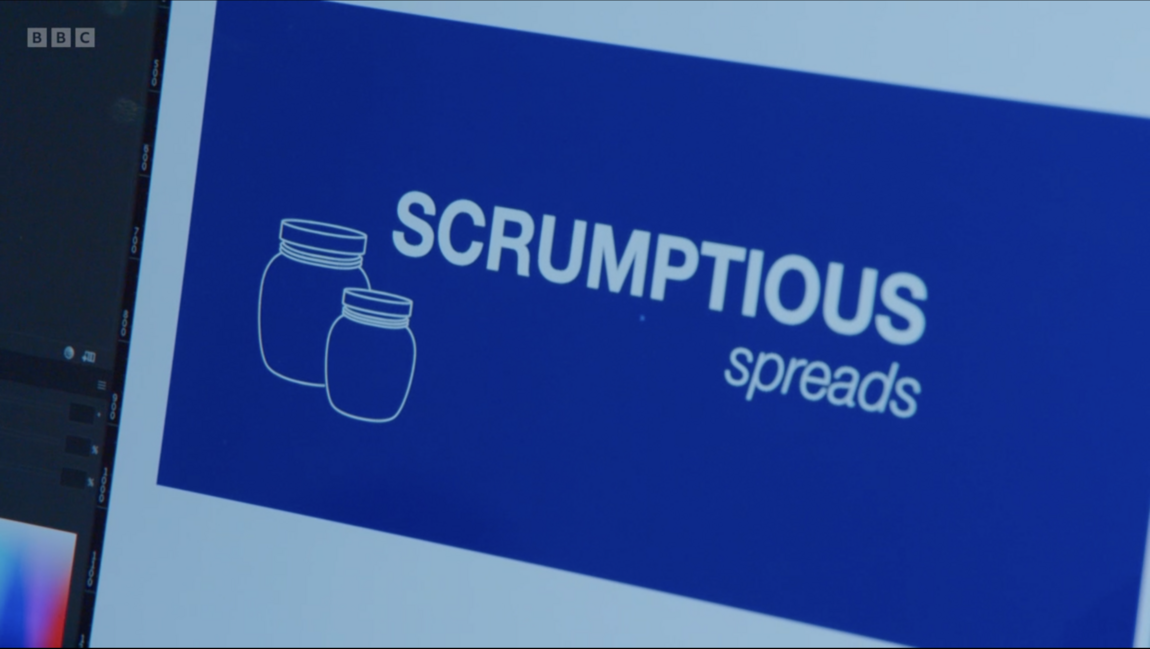
Image: Team Nexus logo design for ‘Scrumptious Spreads’.
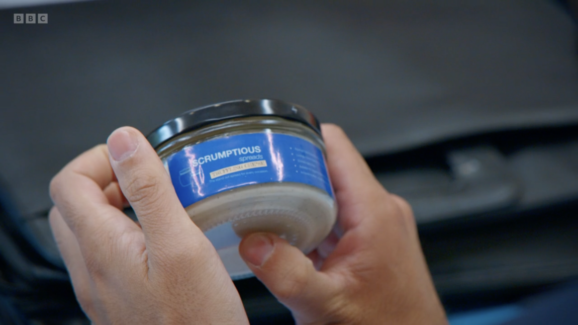
Image: Team Nexus package design for 'Scrumptious Spreads'.
Text: Focusing on the text of the logo, the use of sans serif doesn’t give connotations of luxury. Sans serif fonts can give the impression of contemporary and chic. However, the way the font is placed and the lack of spacing just creates something basic with no style.
Colour: The colour scheme of royal blue and white isn’t very luxurious – even though it has the term ‘royal’ in it. The tone of the colour is quite primary, which cheapens the design. It seems very similar to Tesco’s brand products. Something darker with more contrast would have been more suited. Paired with the white, it creates a clinical feel.
Icon: For the icon, the team chose to add two spread jars. The position of the icons themselves is quite low and creates unbalance in the design. The use of jars gives a nod to the spread aspect of the product but fails to pin down that it’s vegan cheese - It could be any kind of spread. The icons tell you very little about the product and flavour. The illustration style is very simple, adding to the clinical appearance of the logo. If they had used something more organic and hand-drawn, it would have added to the luxury element.
Overall, design-wise, again it’s not that bad for an Apprentice logo. However, for its intended purpose it’s not very suitable. The design looks more like a value range of spread rather than a luxury product.
Webfactory’s take on Logo 1
For Webfactory’s quick take on Team Nexus’s logo, we’ve focused on the luxury aspect of the brand.
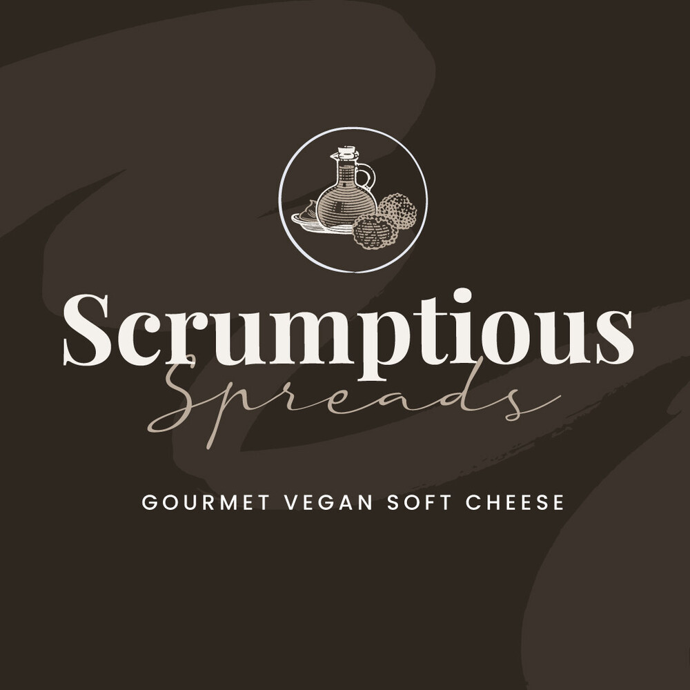
Image: Webfactory's logo design for Scrumptious Spreads
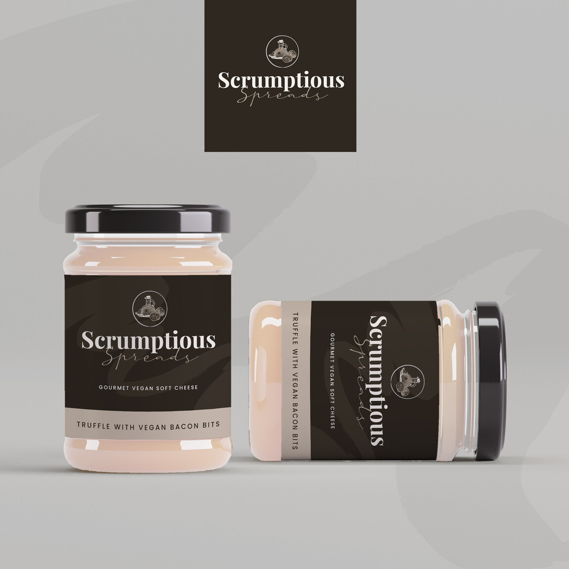
Image: Webfactory's redesign of Scrumptious Spreads
For the colour of the logo and packaging, we used dark and light shades of truffle (brownish grey). The use of the darker shade adds sophistication, class, and elegance to the logo – giving it a luxurious feel. For the text, we’ve used an off-white, which softens the overall look. For the packaging, we’ve kept it simple and classy with a subtle ‘spread’ smear across the jar.
The text of the logo is a serif font. Serif fonts give connotations of tradition, notability, and comfort – which is perfect for a luxury brand. This is paired with a calligraphy-style font, which adds a touch of elegance.
For the icon, we’ve created a badge design showing truffles and cream cheese in a banquet style, like it is laid out on a cheese board. This can be changed to suit the flavours of the jars if they make other flavours.
For the packaging, we’ve kept it simple and classy with a subtle ‘spread’ smear across the jar. The dark label creates a high contrast against the product.
Logo 2 – Team Supereem ‘Big Softie’
In this week’s task, team Supereem wanted to create an exotic vegan cheese. For the flavours, they chose curry, an unusual choice for cheese flavouring.
For the logo, the team boldly opted for an icon only. The design showed a cheese wheel cut into sections, with a green V.
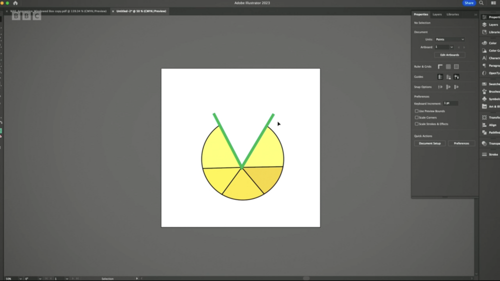
Image: Team Supereem's logo design for 'Big Softie'.
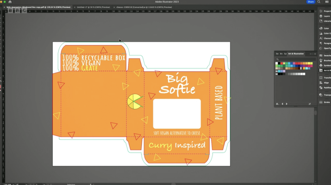
Image: Team Supereem's package design for 'Big Softie'.
Text: The team opted to not add text to the logo. Although it’s common to use an icon stand-alone on occasions, this is typically used when customers are familiar with your brand. As a new brand, they should have displayed the company’s name within the logo.
Colour: For the colour scheme the team chose yellow and green. The use of the yellow is representative of the curry flavourings of the cheese. The green gives connotations of veganism and the environment. Together, the tones are quite harsh.
Icon: The icon is the focus of the design. As mentioned above, the design shows a cheese wheel with a section removed and replaced with a ‘V’ for vegan. The illustration style is very basic and simple in appearance. Without text to anchor its meaning; it could represent anything. There were comments that the icons looked like a ‘Trivial pursuit’ board piece.
Overall, the design was poor. Arguably, the worst logo in the series so far! The icon was vague and gave no representation of the brand name or product itself.
Webfactory’s take on Logo 2
For Webfactory’s quick take on Team Supereem’s logo, we wanted the design to be bold and fun.
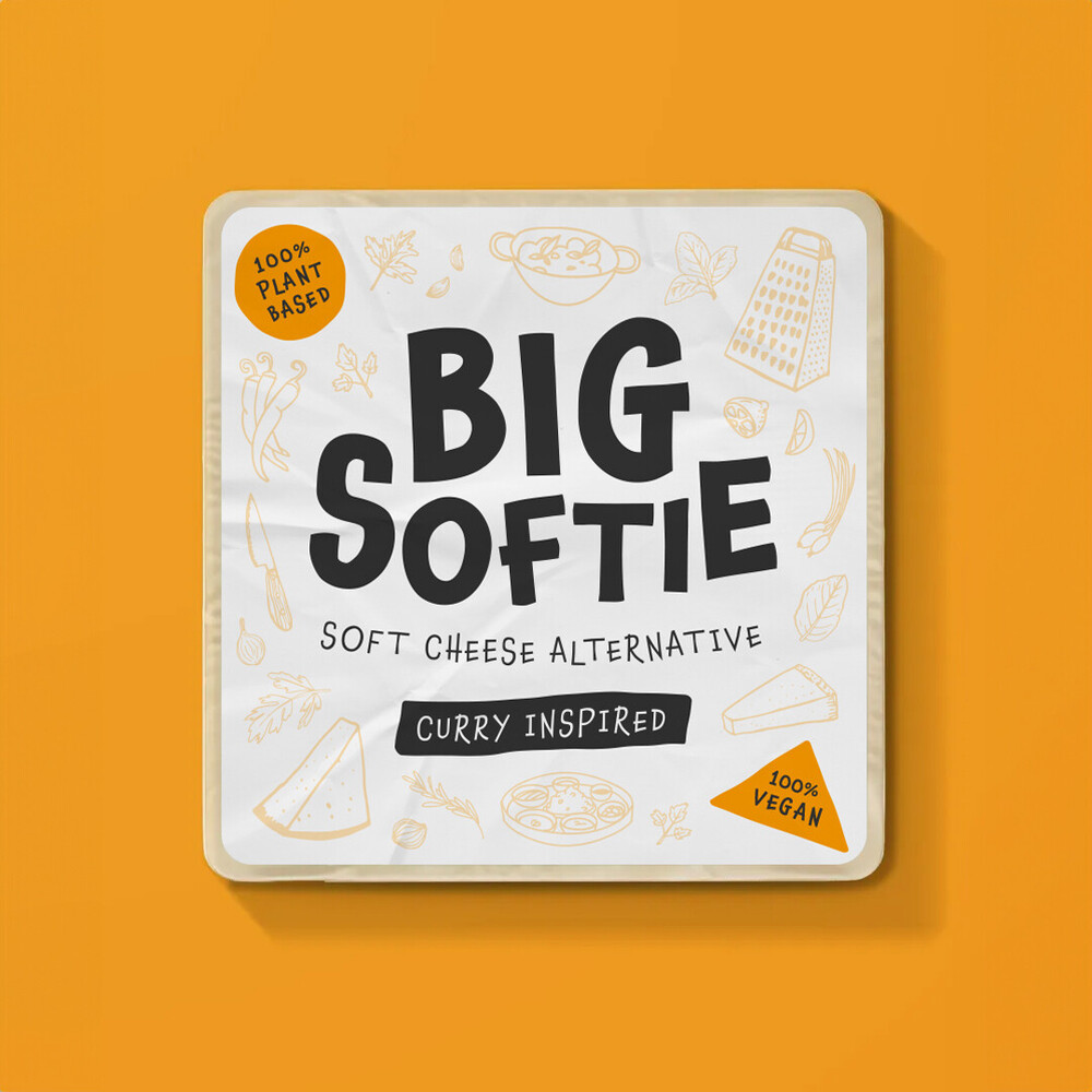
Image: Webfactory's redesign of Big Softie
We’ve used a large, bold font with rounded edges to create a text-based logo that has a playful and fun design. A non-uniform composition and an uneven design enhance the playfulness of the name "Big Softie," which is also reflected in the hand-drawn font style.
The packaging uses a variety of shapes and icons to represent the ingredients, flavour elements, and utensils that may be associated with the product. The hand-drawn style again gives the design a quirky, laid-back feel that could appeal to a wide range of audiences.
The primary colour of the logo is dark grey/black, which allows the design to work with a range of colour schemes. Orange serves as the design's secondary colour to symbolise the "curry-inspired" flavour. Using a single dark colour for the logo allows the secondary colour to be changed based on the product's flavour.
Learn more
If you are interested in logo design, you can learn more about how to create the perfect logo for your business in our article here.